There are all sorts of reasons why prospects don’t convert (we’ll discuss that on Thursday). However, so as not to write a 1000-page book on the subject, I’ve narrowed things down to these 4 critical elements to why your landing pages might suck. Mind you, this is my perspective, and I hold no liability for leaving yours off of the list.

-
Is your CTA a REAL Call to Action?
Or is it more like a suggestion? Humans need encouragement to do what you are asking them to do, so, tell them what you expect from them. And, you should have been carefully persuading them in the direction of utilizing the CTA from near the beginning. Tell them to Click Here, or Read More, or Lemme Havit.
Some marketers utilize a long-copy landing page to keep viewers from being redirected back to the website in the event they come upon it somehow inadvertently. We have a client who prefers his landing pages to function in that way. In the event that long-form copy on your landing page is how you go, make sure there are CTAs occasionally throughout the content in case the reader is a skimmer. Without clear and directional instructions, your efforts are headed for the dreaded drainage canal.
If your reader is self-talking this question, you’re swirling toward the gutter. Is your pre-header, headline, and sub-headline ( the Johnson Box) explicitly grabbing the attention of the reader and raising the curiosity level to read further?
Does any part of the Box speak to the benefits? Try to list as many direct benefits as you can with brief explanations (in bullet form if possible).
The Value Proposition with the copy requires some PROVEN copy trade secrets to make for a good reason for the reader to make their way to the CTA.
-
Does the Design Rank, Or Is it Rank?
If your design stinks to high heaven, you’re sunk into the pit of despair. Let me tell you, the canal water in the pit is not a healthy environment, and you certainly don’t want to exist on a steady diet of it. Think about your prospect’s lungs.
Those who raise their hand and end up at your landing page are half-way home. Don’t screw up the customer journey by having “rank amateurs” design it. Don’t consider that because you have a capture box for their contact information is good enough. It has to be both coordinated with the rest of the campaign but also designed to be mobile-first technology cognizant.
Don’t even think about using any Flash-hungry content on it, including gifs, uber-sized images. Don’t clutter it up with too much information. And above all, don’t have any social media buttons, share buttons or anything that might tempt them to move away from the page.

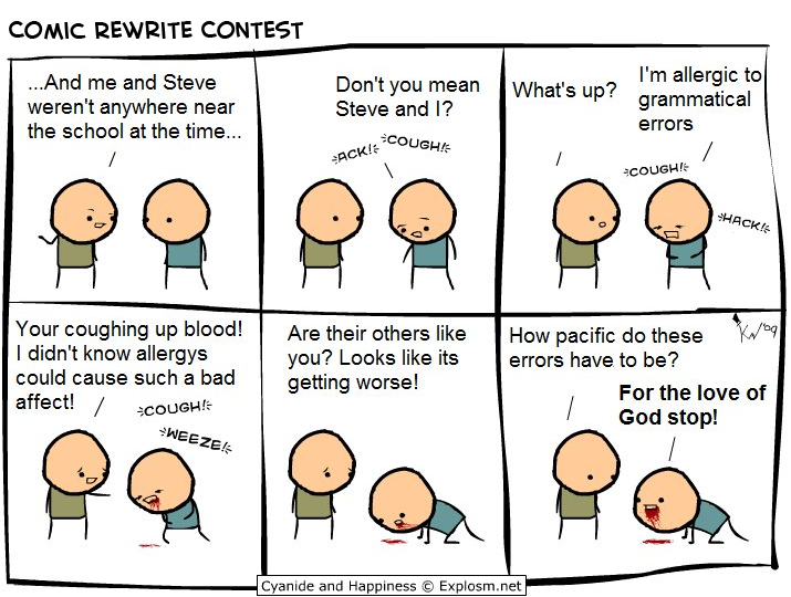
As for grammar and punctuation, TAKE IT EASY. It’s perfectly okay to utilize what we call “Marketing English,” but heaven forbid you take a liking to exclamation marks.
I read somewhere, and I agree wholeheartedly, that exclamations are the symbol for you laughing at yourself. They’re superfluous for almost every use. Sure, one or two in a long-copy sales letter, but come on, what can someone possibly say that warrants three exclamation marks after it???
Another critical part of the design element is utilizing ALL CAPS for the headers, emphasis points, or some other cockamamie rationale. It’s difficult for the skimmers to get it as it breaks their concentration and word-flow when arriving from the top to the bottom of the page.
As for grammar and punctuation, TAKE IT EASY. It’s perfectly okay to utilize what we call “Marketing English,” but heaven forbid you take a liking to exclamation marks. I read somewhere, and I agree wholeheartedly, that exclamations are the symbol for you laughing at yourself. They’re superfluous for almost every use. Sure, one or two in a long-copy sales letter, but come on, what can someone possibly say that warrants three exclamation marks after it???
Another critical part of the design element is utilizing ALL CAPS for the headers, emphasis points, or some other cockamamie rationale. It’s difficult for the skimmers to get it as it breaks their concentration and word-flow when arriving from the top to the bottom of the page.

- Does the Landing Page Carry the Thought Progression?
There is a theme to creating campaigns, and the landing page has to conform to it. If the squeeze page is disjointed or doesn’t consistently flow from a steady stream of consciousness, all the persuasion in the world will be lost when they arrive.
Imagine you are running a marketing campaign for a particularly fun and exciting cocktail affair. Imagine also that all your marketing assets have been featuring all of the delightful wines, whiskeys, rums, and scotches. Add to that all of the chic celebrities that are sure to be in attendance are all A-Listers. The journey toward the landing page is engaging, well-coordinated, edgy, and extremely persuasive
Then they get to the landing page, and there are photos of the food along with their respective recipes. Sure, it is part of the party, but it sure doesn’t belong here (don’t ask me where the recipes belong – I haven’t got a clue to even guess). It might be relegated to an afterthought and scrap all recipes forever.
Sure, a landing page can be long-form, but break it up into logical steps toward your goal of having them sign up.
As I mentioned at the beginning of this diatribe, there could be a 1,000-page book written on this particular topic. But sadly, there is no more gas in the tank to dive any deeper for this guy.
As promised for Thursday, however, is what happens under more normal situations when conversion breaks down.
Until our paths cross again,
Cheers!


